css to keep 5 images in a container with resposive growing/shrinking. Also needs border radius and any padding/margin to be contained within the 20% child width as to not increase parent size
Hi all, this is driving me nuts, hopefully someone can help
All I'm after is a row of images contained within the parent container. Each image should be about 20% (as there is 5) and apart from the last one have a right margin to give some spacing.
It all needs to be responsive so as the screen reduces so do the images.
Thanks, Neil
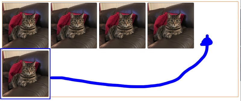
Attached image gives a rough example but the image that wraps needs to be contained within the parent container WITHOUT pushing it past the 100% size (eg each image, including and padding and margin should be 20%)
All I'm after is a row of images contained within the parent container. Each image should be about 20% (as there is 5) and apart from the last one have a right margin to give some spacing.
It all needs to be responsive so as the screen reduces so do the images.
Thanks, Neil
Attached image gives a rough example but the image that wraps needs to be contained within the parent container WITHOUT pushing it past the 100% size (eg each image, including and padding and margin should be 20%)

<!DOCTYPE html PUBLIC "-//W3C//DTD XHTML 1.0 Transitional//EN" "http://www.w3.org/TR/xhtml1/DTD/xhtml1-transitional.dtd">
<html xmlns="http://www.w3.org/1999/xhtml">
<head>
<meta http-equiv="Content-Type" content="text/html; charset=utf-8" />
<title>Untitled Document</title>
<style>
.profileMainGallery {
	width:100%;
	border: 1px solid #ff6600;  /* no border required but just to show held in container */
	box-sizing: border-box;
}
.profileMainGalleryThumb {
	width:20%;
	padding:3px 3px 0 0;
	box-sizing: border-box;
	display: inline-table;
}
.profileMainGalleryThumb img {
	width:100%;
	border: 1px solid #454545;
	border-radius:3px;
	box-sizing: border-box;
}
</style>
</head>

<body>
<div class="profileMainGallery">
    <div class="profileMainGalleryThumb"><img src="http://www.enticom.co.uk/example.png"></div>
    <div class="profileMainGalleryThumb"><img src="http://www.enticom.co.uk/example.png"></div>
    <div class="profileMainGalleryThumb"><img src="http://www.enticom.co.uk/example.png"></div>
    <div class="profileMainGalleryThumb"><img src="http://www.enticom.co.uk/example.png"></div>
    <div class="profileMainGalleryThumb"><img src="http://www.enticom.co.uk/example.png"></div>
</div>
</body>
</html>ASKER CERTIFIED SOLUTION
membership
This solution is only available to members.
To access this solution, you must be a member of Experts Exchange.
SOLUTION
membership
This solution is only available to members.
To access this solution, you must be a member of Experts Exchange.
It is working
.profileMainGalleryThumb {
	width:20%;
	padding:3px 3px 0 0;
	box-sizing: border-box;
	display: inline-table;
        float: left;
}
<!DOCTYPE html PUBLIC "-//W3C//DTD XHTML 1.0 Transitional//EN" "http://www.w3.org/TR/xhtml1/DTD/xhtml1-transitional.dtd">
<html xmlns="http://www.w3.org/1999/xhtml">
<head>
<meta http-equiv="Content-Type" content="text/html; charset=utf-8" />
<title>Untitled Document</title>
<style>
.profileMainGallery {
	width:99%;
	border: 1px solid #ff6600;  /* no border required but just to show held in container */
	box-sizing: border-box;
    display: flex;
}
.profileMainGalleryThumb {
	width:20%;
	padding:3px 3px 0 0;
	box-sizing: border-box;
	display: inline-table;
}
.profileMainGalleryThumb img {
	width:100%;
	border: 1px solid #454545;
	border-radius:3px;
	box-sizing: border-box;
}
</style>
</head>

<body>
<div class="profileMainGallery">
    <div class="profileMainGalleryThumb"><img src="http://www.enticom.co.uk/example.png"></div>
    <div class="profileMainGalleryThumb"><img src="http://www.enticom.co.uk/example.png"></div>
    <div class="profileMainGalleryThumb"><img src="http://www.enticom.co.uk/example.png"></div>
    <div class="profileMainGalleryThumb"><img src="http://www.enticom.co.uk/example.png"></div>
    <div class="profileMainGalleryThumb"><img src="http://www.enticom.co.uk/example.png"></div>
</div>
</body>
</html>
Open in new window