Jorge Maldonado
asked on
Formatting content for SM and XS devices
I am new to Bootstrap and I have the following HTML code:
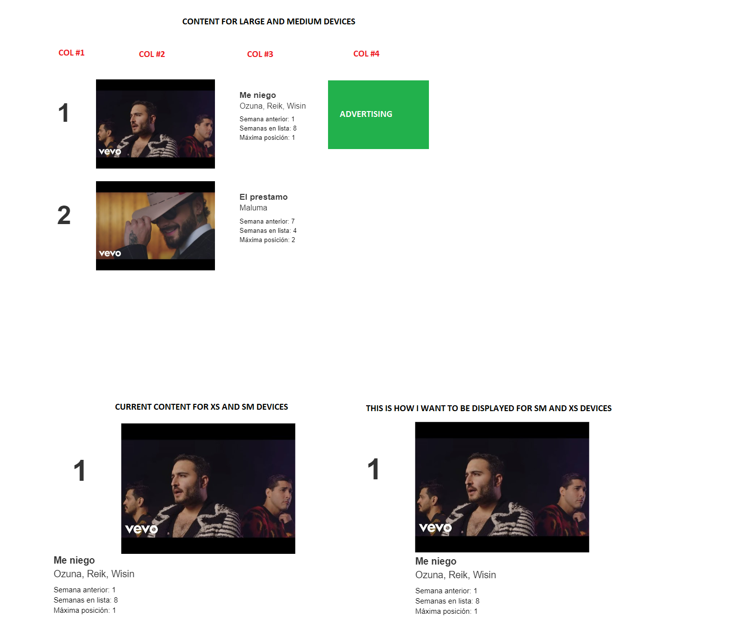
As you can see, for SM and XS devices I have 2 and 10 columns for first 2 divs inside the row div, and 12 columns for divs 3 and 4. This means that the content will occupy 3 rows (inside the main row div). Content displayed in rows 2 and 3 start at column 1 and I want them to start at column 3 for both SM and XS devices.
How can I achieve this effect?

Best regards,
Jorge Maldonado
<div class="row">
    <div class="col-lg-1 col-md-1 col-sm-2 col-xs-2">
    </div>

    <div class="col-lg-5 col-md-5 col-sm-10 col-xs-10">
    </div>

    <div class="col-lg-3 col-md-3 col-sm-12 col-xs-12">
    </div>

    <div class="col-lg-3 col-md-3 col-sm-12 col-xs-12">
    </div>
</div>As you can see, for SM and XS devices I have 2 and 10 columns for first 2 divs inside the row div, and 12 columns for divs 3 and 4. This means that the content will occupy 3 rows (inside the main row div). Content displayed in rows 2 and 3 start at column 1 and I want them to start at column 3 for both SM and XS devices.
How can I achieve this effect?
Best regards,
Jorge Maldonado
ASKER CERTIFIED SOLUTION
membership
This solution is only available to members.
To access this solution, you must be a member of Experts Exchange.
You are welcome.
ASKER
Although I did not implement my solution with the exact code you provided, I could get the idea behind it to solve my issue successfully.
I appreciate your feedback.
Best regards,
Jorge Maldonado