Dinesh Bali
asked on
Slant banner on mobile
Hi,
I have responsive html.
I wanted slant banner. It works well on desktop ( ) but doesn't work on mobile well See Image
 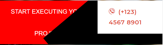 I wanted on mobile banner should be
The Html code to create banner is:
CSS code used is:
Please advise the solution.
I have responsive html.
I wanted slant banner. It works well on desktop (
 ) but doesn't work on mobile well See Image I wanted on mobile banner should be
 The Html code to create banner is:
<div>
    <div class="d-flex">
        <div class="slant">START EXECUTING YOUR PROJECT</div>
        <div style="background-color:black;width: 40%" class="flex-grow-1">
            <a href="#" class="themesflat-button bg-white small">
                <span>
                    <span class="icon">
                        <i class="autora-icon-phone-contact"> </i>
                    </span> (+123) 4567 8901
                </span>
            </a>
        </div>
    </div>
</div>CSS code used is:
.slant {
    background: red;
    line-height: 50px;
    text-align: center;
    width: 60%;
    color: #fff;
    position: relative;
    overflow: hidden;
}

    .slant::after {
        position: absolute;
        content: " ";
        display: block;
        left: 50%;
        bottom: -20px;
        width: 100%;
        transform: rotate(140deg);
        background: black;
        top: 0;
}Please advise the solution.
ASKER
AlsoMany Many thanks for your reply.
Text is going inside blank. Can we wrap text in case of mobile?
Also, the mobile no with white background is taking too big area then expected. See screenshot.
Also, desktop version is now also break.
Mobile Screen:

Desktop Screen after update:

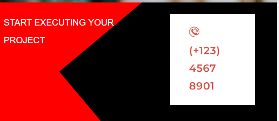
Actual Requirement:

Mobile version is shown above.
Please advise.
Regards,
Text is going inside blank. Can we wrap text in case of mobile?
Also, the mobile no with white background is taking too big area then expected. See screenshot.
Also, desktop version is now also break.
Mobile Screen:
Desktop Screen after update:

Actual Requirement:

Mobile version is shown above.
Please advise.
Regards,
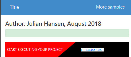
Here is my implementation http://www.marcorpsa.com/ee/t3428.html - based on the code you have shown me.
ASKER
Many thanks Julian
Looks like you have shared the URL for other request of mine. That was solved long time back.
Please see.
Regards,
Looks like you have shared the URL for other request of mine. That was solved long time back.
Please see.
Regards,
No, that is an updated link - I have put the code you posted here into that link.
ASKER
Many thanks Julian for your time.
I am not sure why you have not chosen link below
http://www.marcorpsa.com/ee/t3427.html
Are we addressing wrap text issue only or we are addressing all the issues we faced?
- After adding class="d-flex slant-banner" white area expanding like anything
- On the black area phone no area is very small. Here it expanded.
- Text is not wrapping or adjusting
From the link you provided. What I need to pick and put in my code.
If I am using class "featured-title-inner-wrap
Please advise the change in banner.
Regards,
I took your code as posted from your opening post. If that is not correct please post the correct code.
ASKER
I have updated code advised by you in my original comment.
Please find my revised code.
My banner is coming as detailed in
https://www.experts-exchange.com/questions/29126131/Slant-banner-on-mobile.html?anchorAnswerId=42734078#a42734078
Please advise me what code change I need to do here.
Regards,
Please find my revised code.
<div class="d-flex slant-banner">
<div class="d-flex">
<div class="slant">START EXECUTING YOUR PROJECT</div>
<div style="background-color:black;width: 40%" class="flex-grow-1">
<a href="#" class="themesflat-button bg-white small">
<span>
<span class="icon">
<i class="autora-icon-phone-contact"> </i>
</span> (+123) 4567 8901
</span>
</a>
</div>
</div>
</div>.slant {
background: red;
line-height: 50px;
text-align: center;
width: 60%;
color: #fff;
position: relative;
overflow: hidden;
}
.slant::after {
position: absolute;
content: " ";
display: block;
left: 50%;
bottom: -20px;
width: 100%;
transform: rotate(140deg);
background: black;
top: 0;
}
.slant-banner {
	font-size: 12px;
}
@media (min-width: 768px) {
  .slant-banner {
    font-size: 16px;
  }
}My banner is coming as detailed in
https://www.experts-exchange.com/questions/29126131/Slant-banner-on-mobile.html?anchorAnswerId=42734078#a42734078
Please advise me what code change I need to do here.
Regards,
ASKER CERTIFIED SOLUTION
membership
This solution is only available to members.
To access this solution, you must be a member of Experts Exchange.
ASKER
Many Many thanks.
I applied the code. Your version on URL is great.
Mine has bit different.
When I applied the code My mobile output was:
I adjusted the code as
Made padding as -1px from 15px
Then my mobile version looks like

And the desktop version is:

Text is not wrapping. Also the is no space in the text from left.
Also, phone area white space height should be less as per mockup.
Actually, my this question is resolved. If you want I can open another question for this.
To be honest... This requirement was really tough which you have done very smoothly.
Many thanks to EE and you.
I applied the code. Your version on URL is great.
Mine has bit different.
When I applied the code My mobile output was:
I adjusted the code as
.slant-left, .slant-right {
    padding: -1px 30px 15px 5px;
}Made padding as -1px from 15px
Then my mobile version looks like
And the desktop version is:

Text is not wrapping. Also the is no space in the text from left.
Also, phone area white space height should be less as per mockup.
Actually, my this question is resolved. If you want I can open another question for this.
To be honest... This requirement was really tough which you have done very smoothly.
Many thanks to EE and you.
You should be able to take my code and use it exactly - if it is not working then something else on the page is interferring or it is a Browser issue.
What browser are you testing on?
What browser are you testing on?
ASKER
Yes, It is possible.
Please guide me what should I modify to see the impact on browser.
I will change the settings and let you know.
My browser version is:
Chrome - Version 70.0.3538.102 (Official Build) (64-bit)
Thanks
Please guide me what should I modify to see the impact on browser.
I will change the settings and let you know.
My browser version is:
Chrome - Version 70.0.3538.102 (Official Build) (64-bit)
Thanks
Tried on Chrome - seems to work fine.
Did you have a link to the site?
Did you have a link to the site?
ASKER
Many Thanks Julian
My full code is attached for slider slider.zip
We only modify file \css\dcsstyles.css
for any css overwrite etc.
I checked slider is not well on iphone 5 as well.
Please advise.
Regards,
My full code is attached for slider slider.zip
We only modify file \css\dcsstyles.css
for any css overwrite etc.
I checked slider is not well on iphone 5 as well.
Please advise.
Regards,
I checked slider is not well on iphone 5 as well.I don't have access to an iphone so I would need more information.
I am guessing it is because iphone5 does not support some of the flexbox code we are using.
ASKER
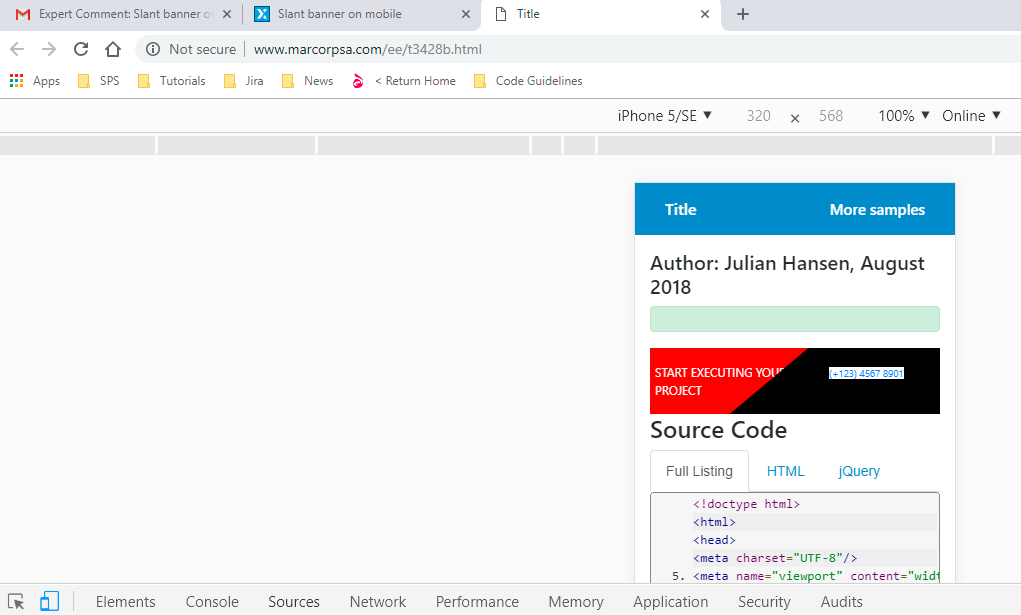
I am just changing iphone from browser only. I am using Toggle devise toolbar from Chrome on developer tool by clicking F12.
Selecting Iphone5. I am not using actual device.
flexbox code is working. The banner looks like
https://filedb.experts-exchange.com/incoming/2018/11_w46/1402386/mobileViewAfterUpdatingScript.png
Regards
Selecting Iphone5. I am not using actual device.
flexbox code is working. The banner looks like
https://filedb.experts-exchange.com/incoming/2018/11_w46/1402386/mobileViewAfterUpdatingScript.png
Regards
ASKER
Have you made any changes to the code? In the url you provided it is working fine.
Only in iPhone text is going inside black. Please see below the screenshot.
We can reduce text size in this case. Screen resolution for iPhone is 320*568.

Regards.
Only in iPhone text is going inside black. Please see below the screenshot.
We can reduce text size in this case. Screen resolution for iPhone is 320*568.
Regards.
Only in iPhone text is going inside blackThat is simply because the screen is too small.
You need to show me a design of what you want it to look like at 320px - then it is simply a case of setting the font size to match your requirement.
ASKER
Please just make 2 pixel less and then I will adjust in media query by my own.
Please advise me the changes.
Many thanks for all your efforts and patience.
Please advise me the changes.
Many thanks for all your efforts and patience.
Make what 2 pixels less?
Your only options here are to
a) Cut down the number of letters you are using
b) bring the font size down
c) Wrap the text
Which one do you want to do?
Your only options here are to
a) Cut down the number of letters you are using
b) bring the font size down
c) Wrap the text
Which one do you want to do?
ASKER
I thing wrap is good.
Or anything which one is easy.
Regards
Or anything which one is easy.
Regards
No, I need something to work against. I don't have time to come up with a design unfortunately. I can help you get to a particular design but you are going to have to give explicit details on what is required.
ASKER
Ok.
I also need to check that,
You please let me know the changes you have done and what I need to do from my side.
I will check the actual details and come back to you. I will open new request for that.
For now please share me the changes I need to do and then I will close this change.
Many thanks
I also need to check that,
You please let me know the changes you have done and what I need to do from my side.
I will check the actual details and come back to you. I will open new request for that.
For now please share me the changes I need to do and then I will close this change.
Many thanks
What changes? I haven't changed anything. The sample is as it was from my first post in this thread.
I can't tell you what to change until I know what the final look must be.
I can't tell you what to change until I know what the final look must be.
ASKER
Ok No problem.
I am closing this request,
As my original post query is resolved.
I am closing this request,
I will check for the changes and will raise another request.
Many Many thanks for your support on this.
I am closing this request,
As my original post query is resolved.
I am closing this request,
I will check for the changes and will raise another request.
Many Many thanks for your support on this.
ASKER
Many Many Thanks
You deserve really as Most Valuable.
Salute to you.
You deserve really as Most Valuable.
Salute to you.
Thank you and you are welcome.
You can try doing something like this
1. add the class .slant-banner to your outer most div
Open in new window
2. Add the following media queryOpen in new window
That will set your font to a smaller size - which should fix on mobile and then increase the font size on larger screens. You can play around with the actual values to get the effect you want.