Excel: Add scale zones on graphic
Hello experts,
I have the following graph:
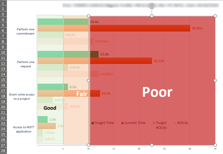
I am trying to add a zone scale as reported manually:
-0-5 good
-5-15 fair
-15+ poor
I supposed that this can be add through y x bar. If scale zone is not possible we can define just lines at 5 and 15.
If you have questions, please contact me.
I attached dummy file.
Test-plan-2.xlsx
I have the following graph:
I am trying to add a zone scale as reported manually:
-0-5 good
-5-15 fair
-15+ poor
I supposed that this can be add through y x bar. If scale zone is not possible we can define just lines at 5 and 15.
If you have questions, please contact me.
I attached dummy file.
Test-plan-2.xlsx
ASKER
Thank you very much for this proposal. I tested and it works.
I reformat based on the need please see attached file.
Now that we get the x-y lines how should I proceed to apply those new data series in the other graphics?
Thank you again for your help.
Test-plan-3.xlsx
I reformat based on the need please see attached file.
Now that we get the x-y lines how should I proceed to apply those new data series in the other graphics?
Thank you again for your help.
Test-plan-3.xlsx
ASKER CERTIFIED SOLUTION
membership
This solution is only available to members.
To access this solution, you must be a member of Experts Exchange.
ASKER
Thank you! Unable to test it right now I will keep you posted.
ASKER
Great! It works! I am curious to know how did you add the data series for the pending graphics, did you use a procedure or add manually?
Thank you in advance for your feedback.
Thank you in advance for your feedback.
Everything is manually added.
Here are the steps.
New data, any data will do.
Select one of the series, change chart type, change the newly added series to XY-line.
Edit data for the new series to the data on sheet X-Y lines.
Add the 2 other series.
Add datalabels to the 3 series, and format color, size, bold, position etc., so only the upper is visible with series name.
Format line types and color.
Change second axis to max limit, and not to display.
Select the legends, select one of the line legends, delete, and do similar for the other 2.
ASKER
Great thank you again!!
Data for the lines are on sheet X-Y lines.
The Fair line is not shown, only the datalabel.
Test-plan-2.xlsx