Ron Bayes
asked on
Excel Age Projection Line Chart
Hello,
Looking for guidance on creating an Excel chart based on projected age. I have a basic employee table where each row represents an employee. In one column I have employee age as of today.
What I'm looking for is a line chart with one line showing a total count of employees under the age of 60 and another line showing employees age 60+. The two axis would be employee count and year. The chart would start today and then project to 2028. So what you should see over time is the age 60+ go up as employees get older while the below 60 will decrease (see image sample).
Thanks!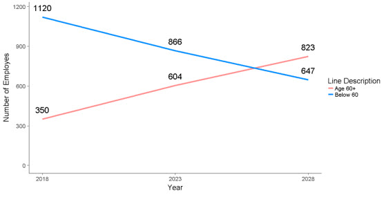
Rob Henson
Can you upload some sample data? Please remove any real names as the data will be publicly visible.
ASKER CERTIFIED SOLUTION
membership
This solution is only available to members.
To access this solution, you must be a member of Experts Exchange.
ASKER
This was helpful and put me on the right path. Thanks.
Thanks for the feedback. Happy to help further if required.