egoselfaxis
asked on
Need help overriding or removing Flex properties in Understrap based custom WordPress theme
I'm currently building a custom WordPress site for a client using the latest version of the Understrap theme development framework, and am running in to some difficulty with controlling the layout of some additional elements that I'm trying to add to the top header.
Here's a link to the site: http://dev.movingpicture.com/
The problem - I believe - is that there are flex properties in place that I can't seem to override, when all I want to do is add a row above my navigation menu that has standard "display:block" type behavior. Instead, however, my element is getting inserted in between the logo and the navigation menu.
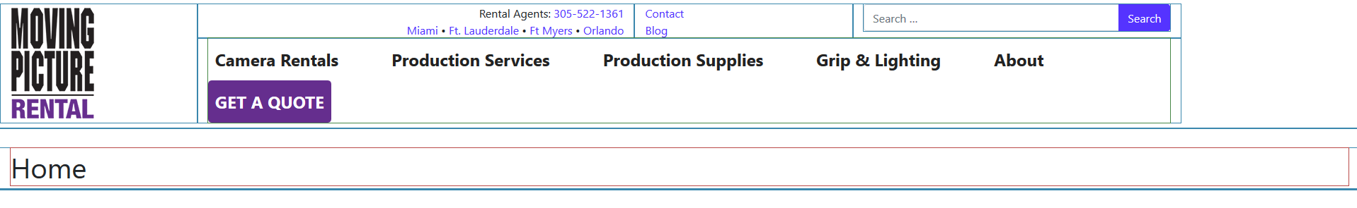
How should I modify my CSS so that I can insert some additional HTML in the top header and have everything wrap correctly the way I've described? More specifically, I'd like to add a snippet of text and a search box above the navigation menu and right aligned (see my JPEG mockup for reference).

Thanks,
-- Yvan
Here's a link to the site: http://dev.movingpicture.com/
The problem - I believe - is that there are flex properties in place that I can't seem to override, when all I want to do is add a row above my navigation menu that has standard "display:block" type behavior. Instead, however, my element is getting inserted in between the logo and the navigation menu.
How should I modify my CSS so that I can insert some additional HTML in the top header and have everything wrap correctly the way I've described? More specifically, I'd like to add a snippet of text and a search box above the navigation menu and right aligned (see my JPEG mockup for reference).

Thanks,
-- Yvan
ASKER CERTIFIED SOLUTION
membership
This solution is only available to members.
To access this solution, you must be a member of Experts Exchange.
.navbar has padding and I think that is what you are referencing.
If you use the browser console by right clicking on the the header and select, 'inspect' the elements section should take you near where the <nav class=navar..."> is. When you highlight the nav bar in the code, you will see in the browser that area is highlighted differently. In chrome, the nav area where there is content is in blue/gray and the outer area where there is padding is in green. This helps give you a clue.
However, are you sure you want the nav bar to be 100% width? That would put your logo at the left edge of the browser.
.navbar {
    position: relative;
    display: -webkit-box;
    display: -webkit-flex;
    display: -moz-box;
    display: -ms-flexbox;
    display: flex;
    -webkit-flex-wrap: wrap;
    -ms-flex-wrap: wrap;
    flex-wrap: wrap;
    -webkit-box-align: center;
    -webkit-align-items: center;
    -moz-box-align: center;
    -ms-flex-align: center;
    align-items: center;
    -webkit-box-pack: justify;
    -webkit-justify-content: space-between;
    -moz-box-pack: justify;
    -ms-flex-pack: justify;
    justify-content: space-between;
    padding: .5rem 1rem;
}If you use the browser console by right clicking on the the header and select, 'inspect' the elements section should take you near where the <nav class=navar..."> is. When you highlight the nav bar in the code, you will see in the browser that area is highlighted differently. In chrome, the nav area where there is content is in blue/gray and the outer area where there is padding is in green. This helps give you a clue.
However, are you sure you want the nav bar to be 100% width? That would put your logo at the left edge of the browser.
ASKER
Yes -- I want the entire header to be 100& width .. with the logo aligned left .. and the navbar and elements above it aligned right (Just like in the screenshot that I included in my original question).
I already had a look at the padding for the navbar and experimented with disabling it using my inspector, but it didn't have the desired effect.
Also ... I'm curious as to why I'm seeing ".SCSS" files being referenced in the inspector tools (instead of .CSS files). Aren't those solely for local development and compilation? Surely those aren't being rendered and compiled in realtime up on the server?
Any other suggestions?
- Yvan
I guess I am confused because your image shows padding/margin (the logo is not at the left edge) but the underline is
Take a look at these examples
https://getbootstrap.com/docs/4.3/examples/pricing/
https://getbootstrap.com/docs/4.3/examples/blog/
The pricing example has the header going to each edge but there is still some space from the left or right edge. Is this what you mean?
https://getbootstrap.com/docs/4.3/examples/pricing/
https://getbootstrap.com/docs/4.3/examples/blog/
The pricing example has the header going to each edge but there is still some space from the left or right edge. Is this what you mean?
ASKER
 Yes .. to clarify, I do want to preserve the container specific padding/margins. I'm guessing your screen resolution might be slightly lower than mine, which is why you're probably not seeing what I'm seeing. I'm set to 1920 x 1080 -- and when I maximize my browser, .. the header is not spanning the entire width (see the attached screenshot -- in which I've purposefully outlined the block level elements).
 -- Yvan
ASKER
Thanks for your help Scott. As you can see, I've made some progress:
http://dev.movingpicture.com/
I still have a lot more work to do, -- but thanks for helping me get over this initial hump :)
- Yvan
http://dev.movingpicture.com/
I still have a lot more work to do, -- but thanks for helping me get over this initial hump :)
- Yvan
Looking good.
I would play with making the font a little smaller for the nav and narrow the gap between each nav item..
I would play with making the font a little smaller for the nav and narrow the gap between each nav item..
ASKER
http://dev.movingpicture.com/
However, .. it appears that this element -- which is wrapped around my nested rows --- is preventing the header from displaying at full width, and I can't for the life of me figure out why (you can inspect the underlying source code of the page to see what I mean):
Open in new window
Any ideas as to what might be going on here? I've attached header-parent.php and header-child.php files for reference (in case you want to compare). Please advise.
header-parent.php
header-child.php