Wordpress site not showing up right on many mobile devices
http://146.66.113.175/~techgard/ on some phones (iPhone with safari browser, screenshots attached) the header and footer are messed up in mobile. On my android phone, it seems as though the site is too wide and I have to scroll to see the content... or maybe it's too narrow? Anyway, I have the theme support people looking into it, but I thought maybe someone here would have an epiphany.
Latest wordpress, using Elementor pro, theme is Gridlabs.
Thanks.
Latest wordpress, using Elementor pro, theme is Gridlabs.
Thanks.
I didn't notice until just now, looking at the captures, that the menu text was behind the slider text. The menu items are not clickable. Does that slider offer a mobile friendly mode?
ASKER
I'll check that, thanks. I do have another question here about my dropdowns not working.
The tilde ~ in URL should not be present as it can cause several issues.
This was use very long time ago...this could work but it is not recommended.
~ usually refers to your home directory
This was use very long time ago...this could work but it is not recommended.
~ usually refers to your home directory
ASKER
I added a media query making the form input and button smaller for devices max 600px, but I am still seeing a broken footer on my Alcatel Pixi android phone.
 css.txt
css.txt
The problem is because the ~ in URL
as long as you will have that this will cause issue and your javascript items on the page will break
as long as you will have that this will cause issue and your javascript items on the page will break
ASKER
The tilde will go away, as soon as we make the site live. I'm not sure we can change that for the dev site, as someone else set it up originally. We're going to be replacing the live site on bluehost, techgardens.com, with this dev site.
ASKER
oh, ok, I cna change that!! Thanks, let me try it!
I have not had a chance to look at this in depth. When using Elementor, you have options for three screen resolutions. Try and stick with using that feature to make things work before doing any changes to the theme or custom css. The reason is you may have multiple elements fighting each other.
ASKER
Thanks, Scott. We had a few problems, and I think they're all fixed. One was a DOM error we were getting because the Captain form shortcode was calling javascript on our live site. One was just a bad layout. It all seems fixed now, and I will close this question.
ASKER CERTIFIED SOLUTION
membership
This solution is only available to members.
To access this solution, you must be a member of Experts Exchange.
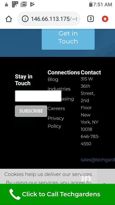
In the footer, the widget for subscribing overlaps the "Connections" menu, due to the width of the input field. The email address in the "Contact" footer runs off the screen due to its length, but this is to be expected with such a small screen.
The header displays correctly, but the menu having a transparent background can be a problem
Screenshot_20190924-101541_Chrome.jpg
Screenshot_20190924-101532_Chrome.jpg