CSS
--
Questions
--
Followers
Top Experts
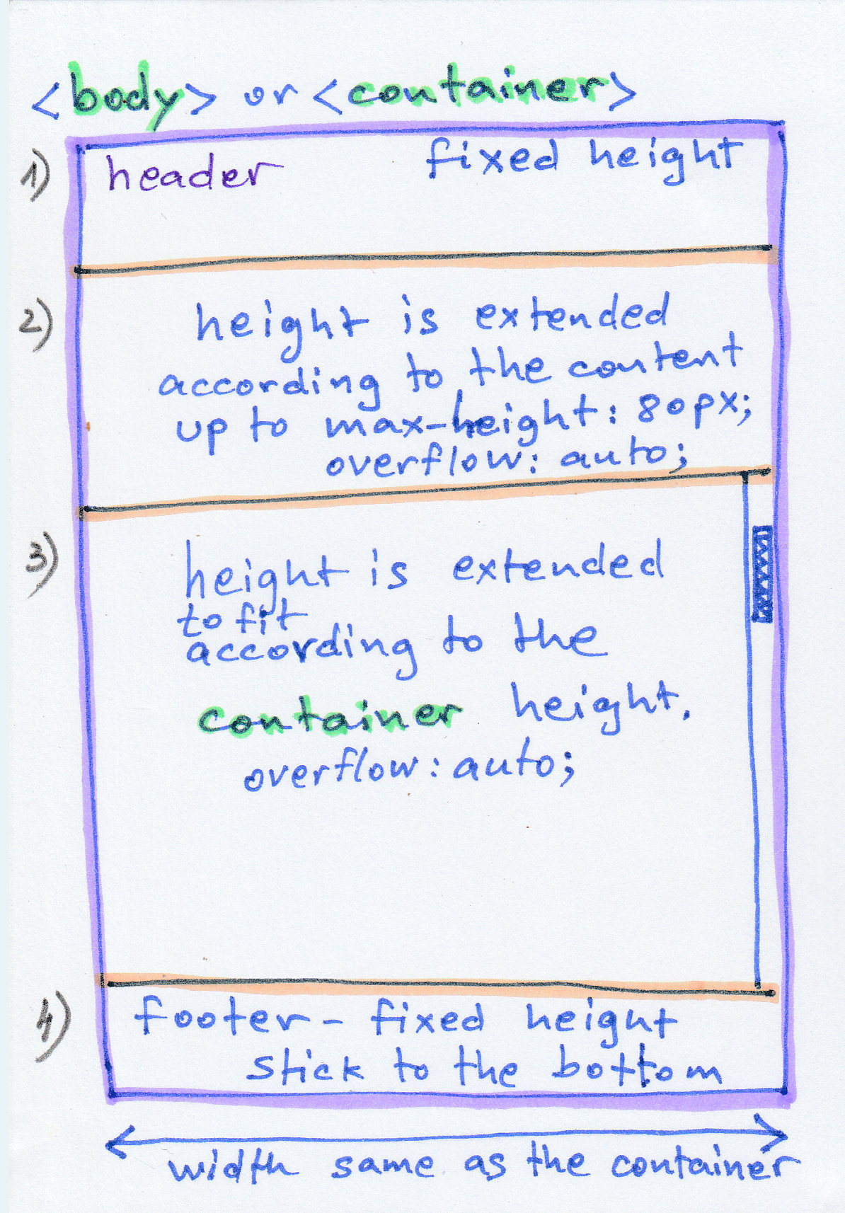
Please see the following diagram with explanations:
Zero AI Policy
We believe in human intelligence. Our moderation policy strictly prohibits the use of LLM content in our Q&A threads.
Something like
CSS
header {
	height: 50px;
}
footer {
	height: 32px;
	line-height: 32px;
	font-size: 11px;
	margin-top: -32px;
}
.container-one {
	max-height: 80px;
	overflow: auto;
}
.container-two {
	max-height: calc(100vw - 162px);
	overflow: auto;
}<div class="d-flex flex-column h-100">
<header class="text-center bg-dark text-white">
<h1 class="d-flex"><span class="flex-grow-1">Header</span><button class="btn btn-sm btn-primary" id="toggle">Toggle Content</button></h1>
</header>
<section class="container-one flex-grow-1 bg-secondary">
Section 1
</section>
<section class="container-two flex-grow-1 bg-primary text-white">
Section 2
</section>
<footer class="bg-primary bg-dark text-white">
Copyright © 2020
</footer>
</div>
Brilliant solution, as always. When viewing your sample page on my mobile device, it does not appear to take up the entire available height. Additionally, the 2nd section, with content enabled, overflows over the footer on mobile and desktop views. It appears from the drawing above that the author is looking to keep the footer visible.
Why did you use the calc() function rather than simply 100% for max-height? I'm certain that there is a valid reason, but I can't think of how it is a better choice. Making the following changes seems to correct the view on the desktop. I did not test on mobile.
.container-two {
	max-height: 100%;
	margin-bottom: 30px;
	overflow: auto;
}
But when I test it, there seems to be a problem: when you change the height of the browser the container-one height gets also relatively changed, while I asked that it should stay fixed (maximum 80px).


EARN REWARDS FOR ASKING, ANSWERING, AND MORE.
Earn free swag for participating on the platform.
by adding:
height: 100%;
to
.container-one
But still, now, when I shrink the height of the Browser, at some position, container-one get's also shrinked along with container-two.
Here is my Html test file: test_layout.html
Please advice.
As I said in my initial question, it's height should be as much as it contains UP TO max-height.
Get a FREE t-shirt when you ask your first question.
We believe in human intelligence. Our moderation policy strictly prohibits the use of LLM content in our Q&A threads.
If you set a max-height, but not a min-height, then it is possible for the container to shrink if there is not enough content to fill it to the max.
If you just want the height of container 1 to always be 80px then just specify the height as 80px. I do not fully understand your requirements, I think.
But still, now, when I shrink the height of the Browser, at some position, container-one get's also shrinked along with container-twoThat happens at around 315px - realistically is this going to be a problem in the real world? Are there devices that are that small and if so are they not going to be having other issues with the content at that size?
The reason it is happening is because you have set a max-height on container one.
Not related by I see you added flex-grow-1 to container 1 - the idea is that you want container 2 be the one with the variable height which is why it has flex-grow-1 (fill available space) - container 1 is already height constrained so it does not need the flex-grow-1 style
EARN REWARDS FOR ASKING, ANSWERING, AND MORE.
Earn free swag for participating on the platform.
Get a FREE t-shirt when you ask your first question.
We believe in human intelligence. Our moderation policy strictly prohibits the use of LLM content in our Q&A threads.
CSS
--
Questions
--
Followers
Top Experts
Cascading Style Sheets (CSS) is a language used for describing the look and formatting of a document written in a markup language. Usually used to change web pages and user interfaces written in HTML, it can also be applied to any kind of XML document. CSS is designed primarily to distinguish the content of a document from its presentation.