Terrygordon
asked on
Change the values of duplicate numbers in a range in Excel
Is there an easy way to change the values of duplicate numbers in a range of values in Excel (Office 365)?
I have an application that contains results for 5 different teams, which are then displayed on a line graph over multiple periods. The problem with this is that if several teams have the same results in one or more periods, only the last team (series 5 on the graph) is visible, as it covers the other lines. I have read suggestions about using different line thicknesses, etc., but I would rather solve this by detecting the duplicates in a range of 5 numbers and adding, or subtracting an incremental value to the values that are duplicated. Also, because of how the graphs are used, and to save someone suggesting it, bar graphs are not an option.
Given that the values can range from 0 to 400, being able to add or subtract, say 1 or 2, but only to the duplicated numbers, would be ideal. Of course, it would also need to ensure that any addition or subtraction did not then give the same value as a number that wasn't changed.
Just to illustrate, if the team results are 300, 298, 300, 305, 300 repeated over say 3 periods, it it easy to see the line that corresponds to teams 2 and 4, but only the line for team 5 will be visible for the other 3 results, as it will be on top of teams 1 and 3. The danger is that if we subtracted 2, from the result for team 5, this would then have the same value as team 2 and the line would overlay the team 2 result.
I would prefer to solve this using formulas but, if it can only be achieved with VBA then that would be fine.
I hope someone can help.
Regards
Terry
ASKER
Hi Bill
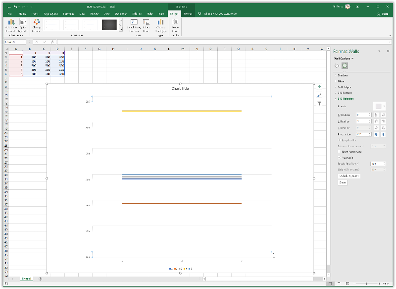
When I open the file, I am still only seeing 3 lines, i.e. the 300 results for series 3 and 5 are obscured by series 1. I notice there is a number (4) for the depth (series) axis but, I don't know if this has any effect, or how to change the value.
I've had a play with the 3-D rotation of the chart area and this seems to work if I set the perspective at 0.1 and the Y rotation somewhere between 0.5 and 1. I will try this on the main project and see how I get on.
Regards
Terry
Odd, looks like I may not have saved my last changes, I think this has those, and here's a capture of what I see here.
EE29177291.xlsx
»bp
EE29177291.xlsx
»bp
ASKER CERTIFIED SOLUTION
membership
This solution is only available to members.
To access this solution, you must be a member of Experts Exchange.
If you could post your solution that would be very helpful to future viewers of this question.
»bp
»bp
ASKER
Not sure how to post a comment on a closed question, but my solution was as follows:
1. Create the original graph, but based only on the results for team 1. This version contains the axis labels, gridlines, etc. and is fully formatted.
2. Copy and paste the graph and select team 2 results as the data. Make the background on this graph transparent and remove the axis labels, etc. Basically just leave the graph and a border round the plot area to scale it to the original graph.
3. Copy the transparent graph and select the data for the remaining teams.
3. Overlay these graph on top of team 1 and shift each graph up or down by a couple of pixels so that each line is visible.
Regards
Terry
4. Repeat this for
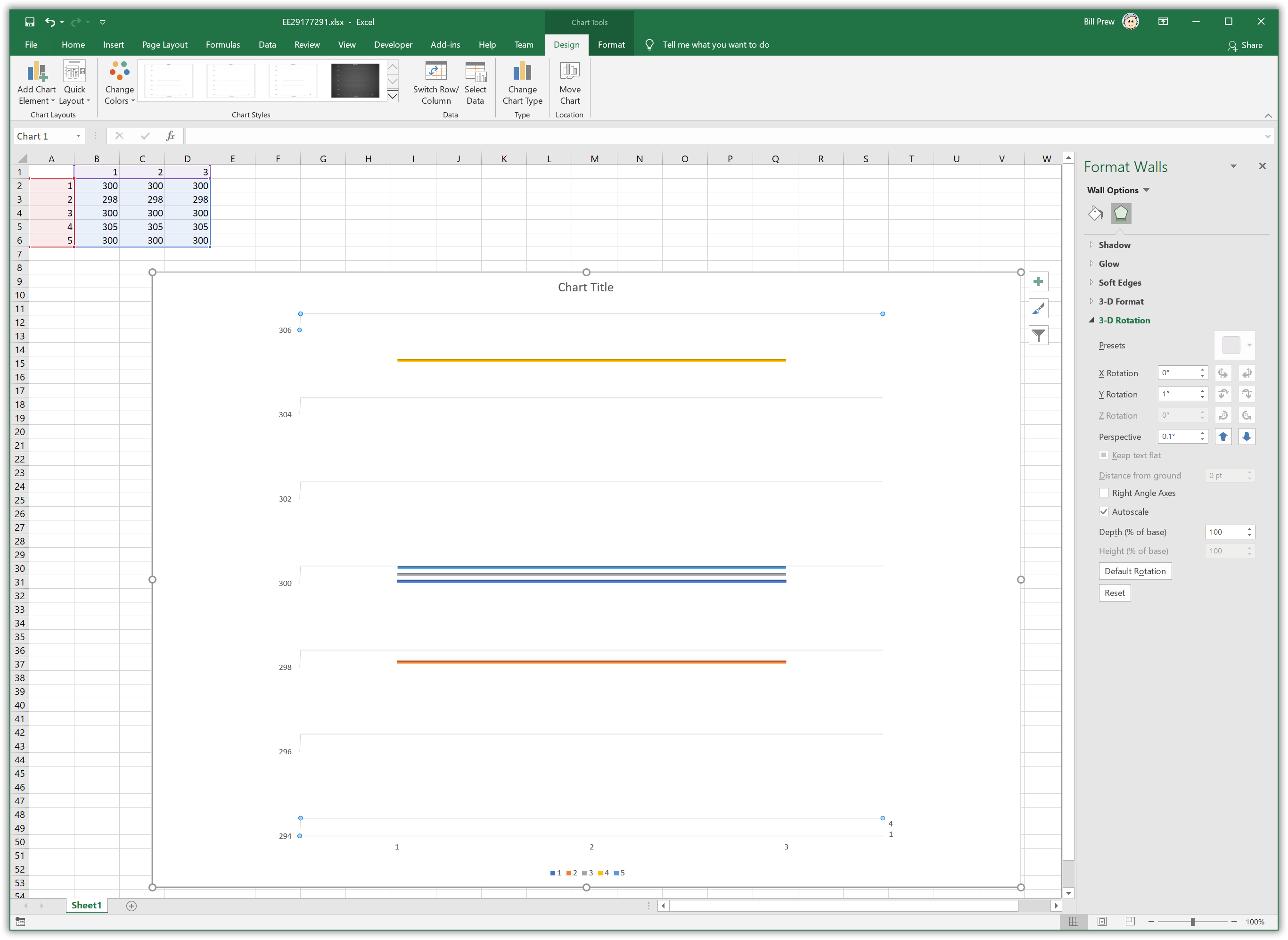
Just a suggestion, how about tweaking the graph design settings a bit to use a 3D design, with minimal actual 3D effect, but using it to separate the overlapping duplicates a bit?
Take a look at the attached and see what you think.
EE29177291.xlsx
»bp