CSS Toggle
Hi Experts,
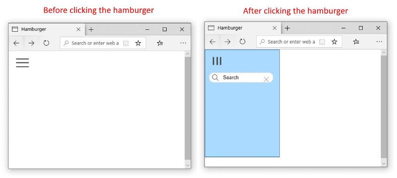
Would you please help me customize the CSS on this page so that the result looks like it's shown on the attached picture? I would really appreciate your help.
 This is the code of my page:
Would you please help me customize the CSS on this page so that the result looks like it's shown on the attached picture? I would really appreciate your help.
 This is the code of my page:
<html>
<head>
<title>Hamburger</title>
<style>
#container {
display: flex;
min-height: 100%;
}
input[type=checkbox] {
position: absolute;
opacity: 0;
}
label {
position: relative;
top: 10px;
left: 20px;
z-index: 1;
display: block;
font-size: 4em;
color: #444;
cursor: pointer;
transform: translate3d(0, 0, 0);
transition: transform .4s;
}
input[type=checkbox]:checked~label {
transform: translate3d(250px, 0, 0) rotate(90deg);
}
.content {
width: 100%;
padding: 40px;
transform: translate3d(0, 0, 0);
transition: transform .4s;
}
input[type=checkbox]:checked~.content {
transform: translate3d(250px, 0, 0);
}
input[type=checkbox]:checked~.slide-menu {
transform: translate3d(0, 0, 0);
}
input[type=checkbox]:checked~.slide-menu .menu li {
width: 100%;
}
.slide-menu {
transform: translate3d(-250px, 0, 0);
position: absolute;
width: 250px;
color: #ddd;
left: 20;
height: 100%;
transition: all .4s;
}
.slide-menu h1 {
margin: 10px;
text-shadow: 1px 1px 1px #000;
color: #628297;
}
</style>
</head>
<body bgcolor="white">
<div id="container">
<input id="toggle" type="checkbox"><label for="toggle">≡</label>
<div class="content">
<br /><br /><br />
</div>
<div class="slide-menu">
<h1> Search</h1>
<!-- search form start -->
<input type="text" />
<!-- search form end -->
</div>
</div>
</body>
</html>ASKER CERTIFIED SOLUTION
membership
This solution is only available to members.
To access this solution, you must be a member of Experts Exchange.
ASKER
It's beautiful, thank you very much!
I was just wondering if it's possible to make the hamburger turn, like it's on the picture I attached
try change:
input[type=checkbox]:checked~label {
	transform: translate(20px, 0px);
}to this:
input[type=checkbox]:checked~label {
	transform: rotate(90deg);
}ASKER
Thank you for your suggestion. I've tried changing the line, but now the hamburger doesn't stay at the same place, it moves far down to the middle of the screen:
<html>
<head>
<title>Hamburger</title>
<style>
#container {
display: flex;
min-height: 100%;
}
input[type=checkbox] {
position: absolute;
opacity: 0;
}
label {
position: relative;
top: 0px;
left: 20px;
z-index: 1;
display: block;
font-size: 4em;
color: #444;
cursor: pointer;
transform: translate3d(0, 0, 0);
transition: transform .4s;
}
input[type=checkbox]:checked~label {
transform: rotate(90deg);
}
.content {
width: 100%;
transform: translate3d(0, 0, 0);
transition: transform .4s;
}
input[type=checkbox]:checked~.slide-menu {
transform: translate(0px, 0px);
background-color: #ffffff;
padding-bottom: 1600px;
}
input[type=checkbox]:checked~.slide-menu .menu li {
width: 100%;
}
.slide-menu {
transform: translate3d(-250px, 0, 0);
position: absolute;
width: 210px;
color: #ddd;
padding-top: 60px;
padding-left: 20px;
height: 100%;
transition: all .4s;
border: 1px solid #000;
}
.slide-menu h1 {
margin: 10px;
text-shadow: 1px 1px 1px #000;
color: #628297;
}
</style>
</head>
<body bgcolor="white">
<div id="container">
<input id="toggle" type="checkbox"><label for="toggle">≡</label>
<div class="content">
<br /><br /><br />
</div>
<div class="slide-menu">
<h1> Search</h1>
<!-- search form start -->
<input type="text" />
<!-- search form end -->
</div>
</div>
</body>
</html>SOLUTION
membership
This solution is only available to members.
To access this solution, you must be a member of Experts Exchange.
ASKER
Thank you so much, I've tried in different browsers, and it looks different. I really appreciate your help.
ASKER