Could you point the link to download (obtain) and how to declare displayflex?
Hi Experts
Could you point the link to download (obtain) and how to declare displayflex (flexbox)?
I found the site but not where to obtain it.
As I heard by using this library the front-end job is greatly simplified compared than pure CSS.
Thanks in advance.
Could you point the link to download (obtain) and how to declare displayflex (flexbox)?
I found the site but not where to obtain it.
As I heard by using this library the front-end job is greatly simplified compared than pure CSS.
Thanks in advance.
ASKER
Yeah - those pages are just giudes on how to use the flex-box properties that already exist within CSS. There's no library to download or install - it's built-in to CSS, so just start using it in your stylesheets.
ASKER
Yes.
Does it really make it easier do develop front end instead of pure CSS ?
Like you had seen I continue having troubles on that subject (also)
Does it really make it easier do develop front end instead of pure CSS ?
Like you had seen I continue having troubles on that subject (also)
First off - it is CSS, so it's no different to any other CSS property. If you use flex-box, you're still writing pure CSS.
Does it make it easier. That's a tricky one to answer. There is a learning curve to using flex-box so initially it will probably be quite difficult to understand. Once you've mastered it, then it can make your layouts a little easier to manage. Remember though, that flexbox is just for laying out your elements. It helps if you're designing a grid based layout and you want elements to wrap or stack etc. It's not used for any styling as such. If your design doesn't need flexible layouts, then you'll probably get no benefit from it.
As an aside, Bootstrap uses flex-box for it's grid system, so if you're using that, then you may not need to worry yourself with it.
One thing to bear in mind as well is Browser support. It's a relatively newer addition so different browsers (particularly older ones) will struggle with it if you don't prefix the properties. A good idea is to write your CSS in the modern way and then maybe run it through an AutoPrefixer so that it works across as many browsers as possible.
ASKER
Well
Based on what you stated since I don't have to much time to study it, due the project prizes, the better thing is stay adapting CSS.
Merge pure CSS and Flexbox (I know it's CSS also) could be a good alternative ?
Just to adapt icons inside a card (like posted on the other questions)
Based on what you stated since I don't have to much time to study it, due the project prizes, the better thing is stay adapting CSS.
Merge pure CSS and Flexbox (I know it's CSS also) could be a good alternative ?
Just to adapt icons inside a card (like posted on the other questions)
Makes sense.
Whether you actually need it or not will depend on your own designs and layout. It's a very specific tool to do a very specific job, so you may not need it at all. And if you do, it's easy enough to just add in some basic CSS (you may have to alter the HTML as well), and build on that.
If you're stuggling with a specifc problem in your layout, then it may be beneficial to post a question to EE. The Experts may then suggest you use FlexBox, or possible Grid, or maybe an entirely different solution - every problem has it's own unique solution :)
ASKER
Referes to the other questions:
Makes a better presentation:

 /*  Flex  */
.rowflex{
	flex-direction: row;
}Makes a better presentation:
 <div class="rowflex">

                            @if ( $model->email === 1)
                                <img src="/img/email.png" class="img-fluid img-responsive">
                            @endif

                            @if ( $model->sms === 1)
                                <img src="/img/sms.png" class="img-fluid img-responsive">
                            @endif

                            @if ( $model->whatsapp === 1)
                                <img src="/img/whatsapp.png" class="img-fluid img-responsive">
                            @endif

                        </div>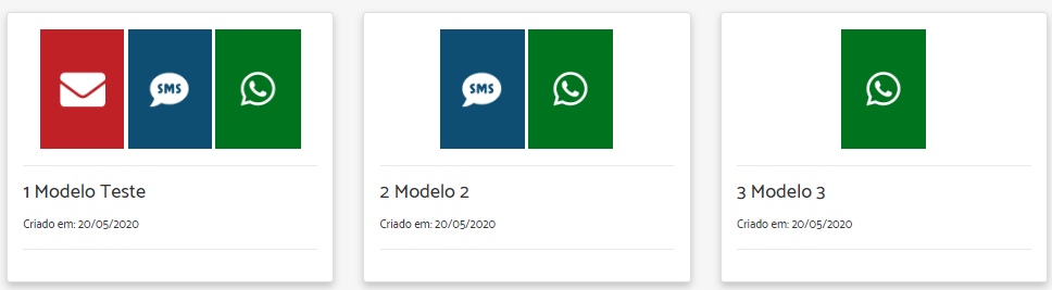
Yeah - that looks like an ideal candidate for flex-box. Generally, you would add properties to the container (.rowflex in your code), and then maybe the flex items (.rowflex img in your code)
ASKER
Chris
One more time excelent to count on your expertise and advices!
In these container cases (a card is one?) I'm planning to start using Flexbox.
One more time excelent to count on your expertise and advices!
In these container cases (a card is one?) I'm planning to start using Flexbox.
You're welcome.
FYI - If you're using BootStrap, it already includes some helper classes for flex-box, so you probably wouldn't even need to add your own CSS - https://getbootstrap.com/d
FYI - If you're using BootStrap, it already includes some helper classes for flex-box, so you probably wouldn't even need to add your own CSS - https://getbootstrap.com/d
ASKER
I'm using Bootstrap. So by using that utilities the job could be easier achievied, isn't it?
ASKER
By using this (on the site you mentioned)
I get these:
  <div class="d-flex flex-row bd-highlight mb-3">

                            @if ( $model->email === 1)
                                <img src="/img/email.png" class="img-fluid img-responsive">
                            @endif

                            @if ( $model->sms === 1)
                                <img src="/img/sms.png" class="img-fluid img-responsive">
                            @endif

                            @if ( $model->whatsapp === 1)
                                <img src="/img/whatsapp.png" class="img-fluid img-responsive">
                            @endif

</div>I get these:

Yes :)
You may just get away with adding a couple of classes to the wrapper:
You may just get away with adding a couple of classes to the wrapper:
<div class="d-flex flex-row">
    @if ( $model->email === 1)
        <img src="/img/email.png" class="img-fluid img-responsive">
    @endif
You probably need a justify class to tell it how to space them:
<div class="d-flex flex-row justify-content-around">
Also, check what version of BootStrap you're using - not sure if flex was in 3.x
<div class="d-flex flex-row justify-content-around">
Also, check what version of BootStrap you're using - not sure if flex was in 3.x
ASKER
No differences...
My chalenge is to fill completelly the card independetly of the number of icons.
My chalenge is to fill completelly the card independetly of the number of icons.
Right - you're gonna struggle with that because you're using images. You can set the images to grow automatically, but they scale, so one image on it's own will be 3 times the size of 3 images together (including the height). I would suggest you go with <div> instead of <img>. Drop the icon inside the div, colour it with CSS. Alternatively, you could just wrap each image inside a div with the background colour set. As the flex-grow-1 class to the div and you should be good.
Something along these lines:
Something along these lines:
<div class="d-flex flex-row">
    @if ( $model->email === 1)
        <div class="flex-grow-1" style="background-color:red">
            <img src="/img/email.png" class="img-fluid img-responsive">
        </div>
    @endif

    @if ( $model->sms=== 1)
        <div class="flex-grow-1" style="background-color:blue">
            <img src="/img/sms.png" class="img-fluid img-responsive">
        </div>
    @endif

    @if ( $model->whatsapp === 1)
        <div class="flex-grow-1" style="background-color:green">
            <img src="/img/whatsapp.png" class="img-fluid img-responsive">
        </div>
    @endif
</div>ASKER
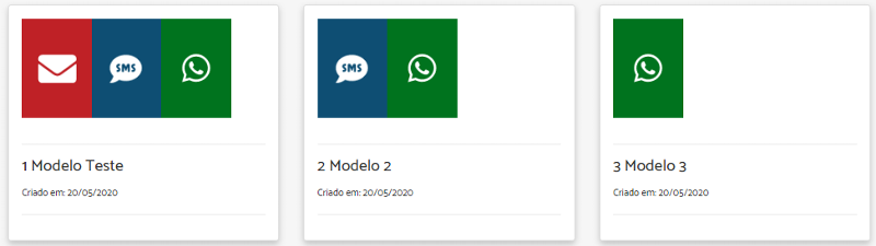
Much closer to needed!

ASKER CERTIFIED SOLUTION
membership
This solution is only available to members.
To access this solution, you must be a member of Experts Exchange.
ASKER
Chris
Thank you very much for all the assistance!
I'm going to follow the steps of your reply.
Thank you very much for all the assistance!
I'm going to follow the steps of your reply.
Good luck with it Eduardo :)
ASKER
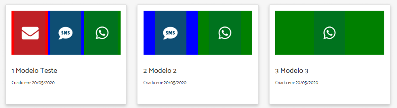
Thank you Chris!
After following your suggestion to make images transparent the result looks pretty good:
After following your suggestion to make images transparent the result looks pretty good:
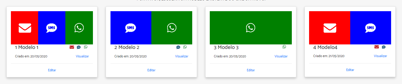
Nice one Eduardo. Looks great :)
ASKER
Thank you for all the assistance!
Not sure what you're referring to. Flex-box is just a collection of CSS properties you use (like background-colour, float, margin etc). It's not a library.
Maybe post a lnik to the website you're referring too, in case I'm missing something