Word document margins question
I have received a Amazon KDP proof of my printed paperback book. I followed instructions on youtube on how to format a book for KDP that is 5.5 X 8.5 I used mirror margins on the document. The problem is (I hope I am understanding this maybe I am not talking about mirror margins) the first page which is the the title of the book and the author name and the dedication page are left justified a bit due to I think the mirror margins. I'm not sure. How would I remedy this? I also have noticed that the odd pages, the pages on the are on the right side of the are just a bit hard to read that are close to the spine. I think I need to increase the margins there a very small amount. How would I do this?
ASKER
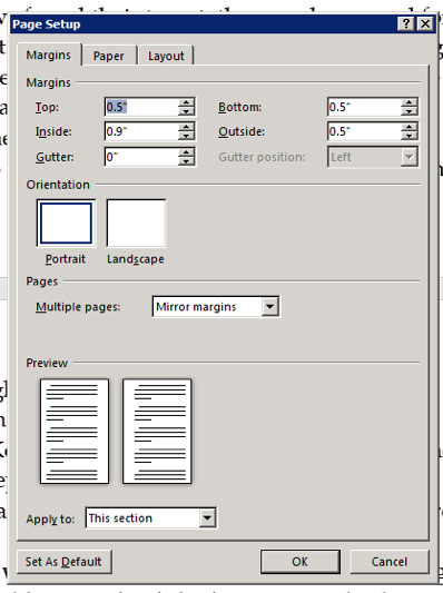
Here is a screenshot of my margins from word. Looks like the gutter is at 0" This would be for a KDP paperback book 5.5 X 8.5
Are these settings the best for that or would you change some of it?
Are these settings the best for that or would you change some of it?
ASKER
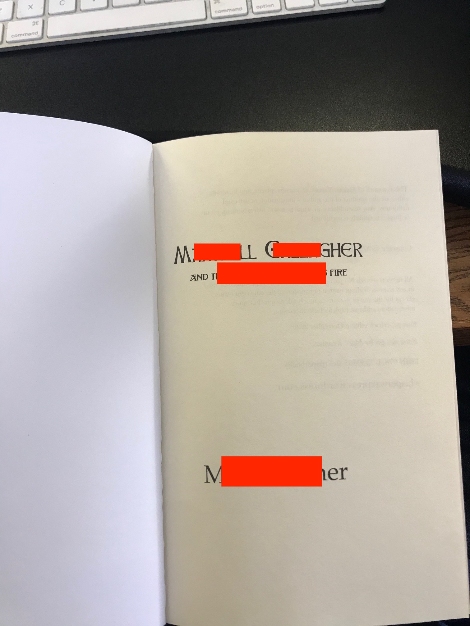
Here are some screenshots of the words close to the gutter and a screenshot of the title page that is too fare over to the left. 

try setting the gutter to 0.2" to see if that helps
ASKER
How about the margins and gutter for the whole document? Should I leave it as the screenshot with the inside margin of 0.9 or do have other recomendations for the custom margins?
make sure select Apply to: Entire document for the gutter setting
Here's a (redacted) screenshot of some pages & the Page Setup used in a recent 6×9 inch book I produced for publication via KDP:
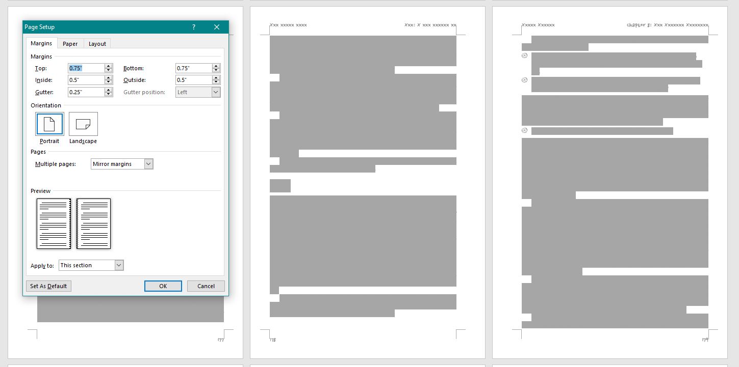 I used "mirror margins" with inside margins of 0.5" and a gutter margin of 0.25" to achieve a ¾" binding margin.
However, since I could have achieved exactly the same result by specifying an inside margin of 0.75", why would I bother using a gutter margin?
Firstly, my background includes quite a few years in "old-school" typography and printing, so I think in terms of specifying a "gutter" to allow for the binding. For my use of Word though, I find that the user interface gives better feedback when I specify a gutter margin. It doesn't show up particularly well with the above screenshot, but compare the two Page Setup dialogs below where I've used an exaggerated inside margin:
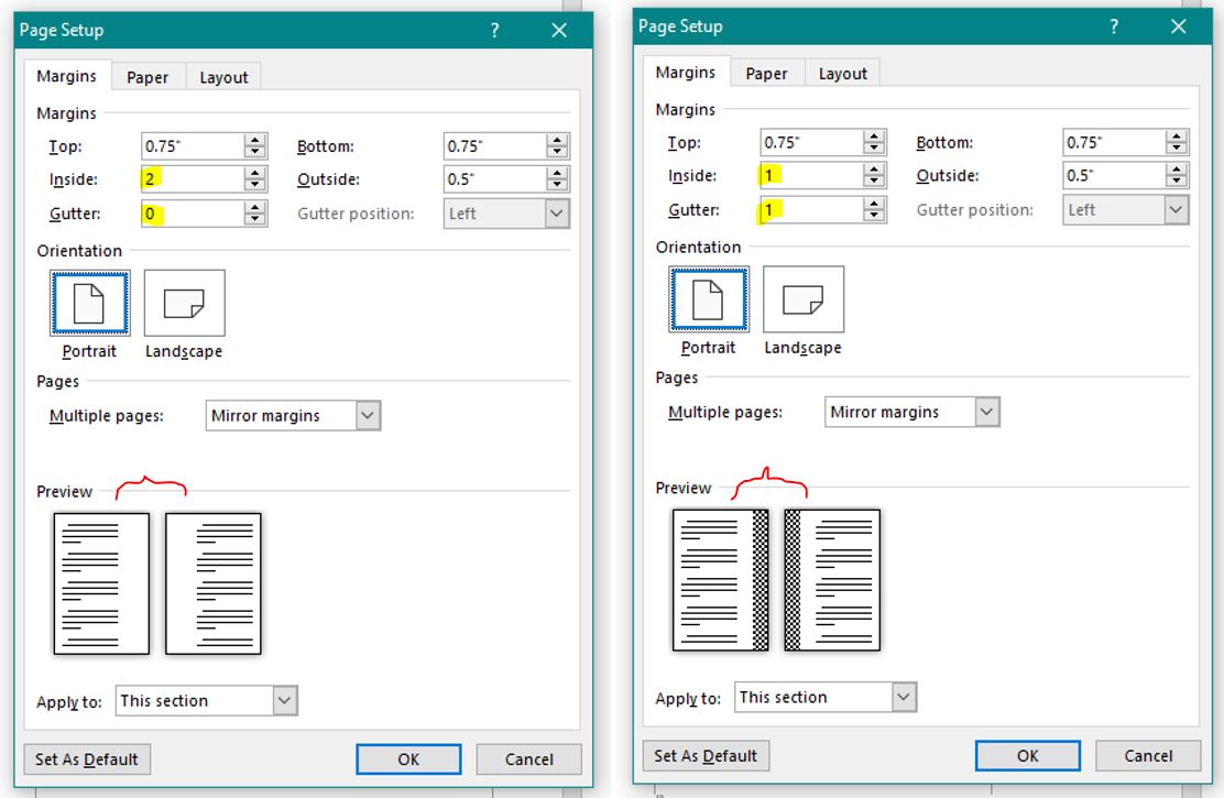 Both will give the same result — a binding margin of 2" — but the one on the right more clearly shows the area that will be reserved for the binding.
For most books, the difference is just a UI preference. However, if you ever need to include pages set landscape within a duplexed book, having the visual reference cues will be very helpful.
To answer your question about adjusting certain pages to effectively "override" the margin settings, I recommend that you just adjust the paragraph indentation for the content on those pages. For example, if you wanted the entire content of your title page to be moved over by ¼" to the left, you could select the content and use the Paragraph dialog to apply a Left indent of -0.25" and a Right indent of 0.25".
---
Note about layout cues: Word provides other visual cues to help with layout via the extensive Word Options dialog. The "crop marks" included in my first screenshot above provide visual feedback about where the text area is within the pages, and can be toggled on via Word Options > Advanced > Show document content. Text boundaries can also be turned on (although their display can be a bit distracting in complex layouts because they show the boundaries of every paragraph on a page).
I used "mirror margins" with inside margins of 0.5" and a gutter margin of 0.25" to achieve a ¾" binding margin.However, since I could have achieved exactly the same result by specifying an inside margin of 0.75", why would I bother using a gutter margin?
Firstly, my background includes quite a few years in "old-school" typography and printing, so I think in terms of specifying a "gutter" to allow for the binding. For my use of Word though, I find that the user interface gives better feedback when I specify a gutter margin. It doesn't show up particularly well with the above screenshot, but compare the two Page Setup dialogs below where I've used an exaggerated inside margin:
Both will give the same result — a binding margin of 2" — but the one on the right more clearly shows the area that will be reserved for the binding.For most books, the difference is just a UI preference. However, if you ever need to include pages set landscape within a duplexed book, having the visual reference cues will be very helpful.
To answer your question about adjusting certain pages to effectively "override" the margin settings, I recommend that you just adjust the paragraph indentation for the content on those pages. For example, if you wanted the entire content of your title page to be moved over by ¼" to the left, you could select the content and use the Paragraph dialog to apply a Left indent of -0.25" and a Right indent of 0.25".
---
Note about layout cues: Word provides other visual cues to help with layout via the extensive Word Options dialog. The "crop marks" included in my first screenshot above provide visual feedback about where the text area is within the pages, and can be toggled on via Word Options > Advanced > Show document content. Text boundaries can also be turned on (although their display can be a bit distracting in complex layouts because they show the boundaries of every paragraph on a page).
ASKER
OK. So what is your recommendation for a 5.5 X 8.5 KDP paperback for the margins and gutter if you were doing it?
The margins are somewhat dependent on the number of pages, since the "gutter" for the binding needs to be larger as the number of pages increases. This KDP page explains some of the parameters to consider.
The other factor to consider is the space for your page header/footers (Page Setup's Layout tab). I recommend checking some existing 5½×8½" books with approximately the same number of pages as your book to see what has been used. There is no hard-and-fast "rule", but KDP's upload checker will put out an alert (or error) if your content extends beyond their recommended margins.
The other factor to consider is the space for your page header/footers (Page Setup's Layout tab). I recommend checking some existing 5½×8½" books with approximately the same number of pages as your book to see what has been used. There is no hard-and-fast "rule", but KDP's upload checker will put out an alert (or error) if your content extends beyond their recommended margins.
ASKER
Page count is 220
Trim size: 5.5 x 8.5
Interior font 11.5 Book Antiqua
I'm just looking for an educated guess on margins and gutter
Trim size: 5.5 x 8.5
Interior font 11.5 Book Antiqua
I'm just looking for an educated guess on margins and gutter
ASKER CERTIFIED SOLUTION
membership
This solution is only available to members.
To access this solution, you must be a member of Experts Exchange.
For a bound book with even and odd headers, you should see a Gutter field in the Page Setup>Margins dialog. That adds an extra margin to the spine side of each page. Put another way, it moves the text away from the book fold so it's easier to read. My 6"x9" books use a gutter of 0.5".