Vertical Align
Hi Experts,
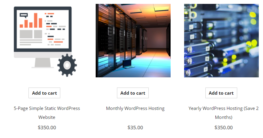
How can I align the 3 products at https://www.aces-project.com/index.php/shop/ to the bottom, so that the 3 "Add to cart" buttons align?
Thanks!
How can I align the 3 products at https://www.aces-project.com/index.php/shop/ to the bottom, so that the 3 "Add to cart" buttons align?
Thanks!
first image does not go well with 2 others! > bad design
make all images 250 x 250 px
and use text like
5-Page Simple Static<br>WordPress Website<br><br>[add to cart]
Montly<br>WordPress Hosting<br><br>[add to cart]
Yearly<br>Wordpress Hosting<br>(Save 2 months)<br>[add to cart]
make all images 250 x 250 px
and use text like
5-Page Simple Static<br>WordPress Website<br><br>[add to cart]
Montly<br>WordPress Hosting<br><br>[add to cart]
Yearly<br>Wordpress Hosting<br>(Save 2 months)<br>[add to cart]
ASKER CERTIFIED SOLUTION
membership
This solution is only available to members.
To access this solution, you must be a member of Experts Exchange.
Hey there,
My approach to this would be to use a flexbox. Set each <li> to a flex container, based on a column and then add a space between. To get this to work, think of your content as 2 blocks - the image & the text/button section. This way, the space between will just add space between the image and the text block (forcing it to the bottom) to fill the content. To get around the single/double line of text, I would just set a min-height on that so that the description allows for 2 lines without breaking the layout.
You'd need to edit your HTML so each <li> contains 2 'blocks'
And here's a really great intro into flexbox - https://css-tricks.com/sni
My approach to this would be to use a flexbox. Set each <li> to a flex container, based on a column and then add a space between. To get this to work, think of your content as 2 blocks - the image & the text/button section. This way, the space between will just add space between the image and the text block (forcing it to the bottom) to fill the content. To get around the single/double line of text, I would just set a min-height on that so that the description allows for 2 lines without breaking the layout.
You'd need to edit your HTML so each <li> contains 2 'blocks'
<li>
   <img src="...">

   <div>
      <p>some text</p>
      <p>price</p>
      <button>...</button>
   </div>
</li>And here's a really great intro into flexbox - https://css-tricks.com/sni
or, make everything image, except button at the end
and put whatever you want, any font any images etc...
That's going to look awful in WooCommerce - you'll basically be overlaying your main product image with the description and price (no longer able to update the price or description without changing your image) . Not to mention the SEO implications of doing that ! With respect ... terrible idea ;)
With respect ... terrible idea ;)everything = product image + description
price can be separate with button, no issue with that
and you can use title/alt on the image...
With respect ... it is a nice idea ;)
So changing a Product Title means changing image, and the main product image has that embedded, as well as the tiny 100x100 thumbnails. Embedding text in an image is so 1990s :)
cmon, this is not a store like amazon
if you look have that page, it has 3 products only :)
anyways, the other idea is use this format
use same 250x250px image on top
[add to cart]
XXX.XX $
decription
(hint)
then all buttons will be aligned, price will be aligned :)
if you look have that page, it has 3 products only :)
anyways, the other idea is use this format
use same 250x250px image on top
[add to cart]
XXX.XX $
decription
(hint)
then all buttons will be aligned, price will be aligned :)
like this
cmon, this is not a store like amazon
Haha - guess it doesn't matter what it looks like then
... and yes, I agree with you about the images sizes being the same. I only pointed out the downsides of going with a text-based image because that was the accepted answer, and I simply wanted to explain why it was a terrible idea. It look like the OP has gone with the image size solution anyway, so it's a moot point.
fixed size image is must...
and all product images should look similar...
right now one is art, others are photo
art is not even clear, it is blurry, and distorted :) resized un-proportionally, gear is not circle anymore :)
monitor size is non standard 1x1 or 4x5...
I guess he will change it later...
and all product images should look similar...
right now one is art, others are photo
art is not even clear, it is blurry, and distorted :) resized un-proportionally, gear is not circle anymore :)
monitor size is non standard 1x1 or 4x5...
I guess he will change it later...
then use the text as 2 lines in all