Python
--
Questions
--
Followers
Top Experts
brilliant_caesar_shift2.pybrilliant_caesar_shift3.pybrilliant_caesar_shift4.py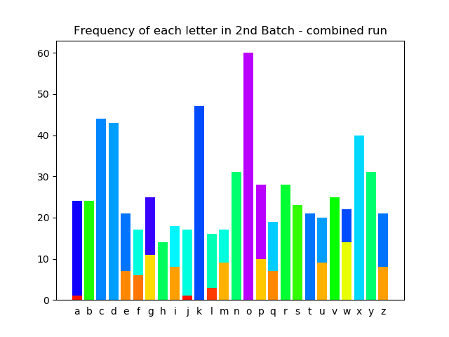
 So, I recently got suckered into signing up for a weekly-thingie from Brilliant, and their last two e-mails involved Python.
They were starting w/ a simplistic Caesars Shift-cypher, and they branched over to trying to plot the distribution of letters in misc. text (after encoding) and trying to determine if they were natural language (more random) vs. machine generated (more uniform)… i.e., given the most common letter, you might guess the cypher offset.
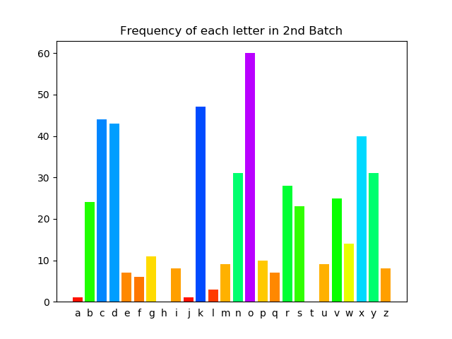
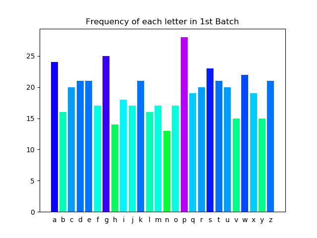
Anyway, I followed all of it (and besides doing it on their interactive web-page, did it in VS Code so I’d have a local copy of their exercises), and in their example they plotted two different bodies of shift-cyphered TXT, i.e., they generated two different PNGs (see output1.png and output2.png), which were generated via brilliant_caesar_shift2.py and brilliant_caesar_shift3.py.
Being the pedant I am, I thought “well, hell – why don’t I do both in one pgm/script” . . . but the 2nd PNG comes out weird (see output1a.png -which is fine, and output2a.png – the weird one).
I ran these both in brilliant_caesar_shift4.py.
In its first iteration I simply copied everything on down from the code = “ line, but given the weird PNG, I then tried renaming code/letter_counts/letter_colors to end with a suffix of 2 (thinking, I guess, that *something* was getting carried forward), and then -with the same weird PNG, I even copied the import and alphabet lines down below (adding a 2 suffix to even those). And still the weird PNG.
So, do you have any idea *why* I’m getting the weird 2nd PNG (again, given that if I run it alone, like in brilliant_caesar_shift3.py, it comes out fine)?
This made me miss cocktail hour last night I was so busy trying the different iterations!! 😊
TIA
Zero AI Policy
We believe in human intelligence. Our moderation policy strictly prohibits the use of LLM content in our Q&A threads.
Many thanks.
I'm a long-time SAS user and it sure seemed that some data was being "retained"/aka the stacking.
That was my (incorrect) thinking that by IMPORTing again (as plot2) it might have taken care of it.
No insult to you, but I had a funny feeling it was going to be something relatively simple.
Again, really appreciate you getting back to me. Happy New Year!
If you are interested here's how you could show both charts on the same figure.
import matplotlib.pyplot as plt
import pandas as pd

alphabet = "abcdefghijklmnopqrstuvwxyz"

code = """
yfdpcpoplhhwdpssbjnsqvtlcpzpxqugtjphvgotuvwxufgoqigxwgkskduooyeuoue
fjlnmsqpgxrmcseeliswdheywseqgcbeothskxdzekgxmmkildjnaqbukprpfaaknsu
qpdwayqaqfxsoapvsgreqydqjnkpjghvrkygtidzibhrqkmocukhcunpjcazzvomtsc
fgycwfltmiegaejwcqrgsnxxcbtcrckufwsdxdhbxgppxcuzapbdhftzmugryfseavv
bssqlxanvmfwwzityziixasivzkmvtfczqmdgkabcnjbyhaoealengfptuedlmvryeb
titbwqkekzdpmbtiphdkwwiduassvbgalxgrfhrjrjplxpujrprqzcpcdqsjorigazt
kwwlnwbjryrzhgcttroyemuwwixwufymnknirzmexyowobvardlqktzajzoijwulomg
ztefdpftjealzapcgipgaaspuzxklvd
"""

code2 = """
swodkdbkfovvobpbywkxkxdsaeovkxngrycksndgyfkcdkxndbexuvoccvoqcypcdyx
ocdkxnsxdronocobdxokbdrowyxdrockxnrkvpcexukcrkddobonfsckqovsocgrycop
bygxkxngbsxuvonvszkxncxoobypmyvnmywwkxndovvdrkdsdccmevzdybgovvdrycoz
kccsyxcbokngrsmriodcebfsfocdkwzonyxdrocovspovoccdrsxqcdrorkxndrkdwym
uondrowkxndrorokbddrkdponkxnyxdrozonocdkvdrocogybnckzzokbwixkwoscyji
wkxnskcusxqypusxqcvyyuyxwigybuciowsqrdikxnnoczksbxydrsxqlocsnobowksx
cbyexndronomkiypdrkdmyvycckvgbomulyexnvocckxnlkbodrovyxokxnvofovckxn
ccdbodmrpkbkgki
"""

letter_counts = [code.count(l) for l in alphabet]
letter_colors = plt.cm.hsv([0.8*i/max(letter_counts) for i in letter_counts])

letter_counts2 = [code2.count(l) for l in alphabet]
letter_colors2 = plt.cm.hsv([0.8*i/max(letter_counts2) for i in letter_counts2])

fig, ax = plt.subplots(2)

ax[0].bar([l for l in alphabet],letter_counts, color=letter_colors)
ax[1].bar([l for l in alphabet],letter_counts2, color=letter_colors2)

plt.show()If you don't mind, however, a few quick questions ... for inquiring minds :-)
1) you import pandas as pd, but I don't see any further pd references - did I miss something?
2) are fig and ax Python keywords, or (as I assume) just user-variables feeding/defining plt.subplots()?
3) I notice there is no longer a plt.xticks or xticks_params - does the first parameter in the ax[].bar statements (i.e, [1 for 1 in alphabet] obviate the need for xticks (and range(26))?
and, lastly...
4) instead of plt.show() could I use plt.savefig?
5) and if i wanted a title would i be constrained to just one (up top) or could have two, explaining each?
Thanks again, I will quaff a dram of Lagavulin 16 in your name later tonight! (as I can no longer get any Old Pulteney 21 over here)


EARN REWARDS FOR ASKING, ANSWERING, AND MORE.
Earn free swag for participating on the platform.
2 Not keywords, more like conventions.
3 Basically.
4 Yes.
5 You could add a title to each plot separately using the set_title method of ax[x]..
Just realized I hadn't replied to your last... Thanks again -for all your posts.
BTW - I was going over your latest (using fig, ax, etc.) and noticed you went with my plt.cm.hsv
statement . . . so I looked that up to see just exactly that does (the arguments I sorta understood, but now I know what HSV is), and damn . . . the overall body of Matplotlib docs is mind-boggling; one could spend eons in this alone!
Anyway - again thanks for everything; Happy Weekend to All.
Python
--
Questions
--
Followers
Top Experts
Python is a widely used general-purpose, high-level programming language. Its design philosophy emphasizes code readability, and its syntax allows programmers to express concepts in fewer lines of code than would be possible in other languages. Python supports multiple programming paradigms, including object-oriented, imperative and functional programming or procedural styles. It features a dynamic type system and automatic memory management and has a large and comprehensive set of standard libraries, including NumPy, SciPy, Django, PyQuery, and PyLibrary.